THE COVER DESIGN PROCESS
The illustrator
The stunning new covers for the Old Kingdom series were illustrated by Sebastian Ciaffaglione - you can find more of his amazing work at sebastiancreative.com
After studying illustration at NMIT Sebastian Ciaffaglione began a freelance art career based out of Melbourne. A strong desire to push his own artistic boundaries, striving always to improve and learn, has formed his reputation as a versatile artist who emphasises professionalism and flexibility.
Sebastian has kindly permitted us to use some of the illustrations that were 'left on the cutting room floor' to help us show some aspects of the cover design process.
Sabriel
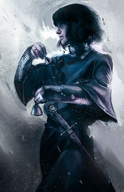
These were the very first roughs Sebastian presented, to show us the sorts of illustrations he might do for all four books. The brief was to provide character portraits that could stand alone, for use in marketing material as well as on the covers. Sabriel has been illustrated many times, so one of the challenges for Seb was to come up with a new vision for the characters, based on his own reading of the books.
In Seb's words:
'What I sometimes like to do is try to describe a character without mentioning what they look like or what their job is. I find it's a good way to get to the core of a character. For instance, with Sabriel - I would describe her as brave, stoic, dutiful, altruistic, loyal, responsible and mostly lacking in self pity. She jumps right on board in assuming her responsibilities without even blinking. Even though she doesn't feel fully up to the task, she proceeds anyway because it is her duty. Her duty means she has to be brave and she has to face nightmares. She has to look horrors right in the eye and fight. I didn't at any point think this qualified her as a warrior though. She seems to fight because she has to. Which is why I originally focused on her bells instead of her sword.'


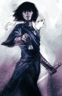
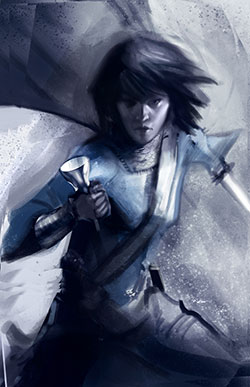
There was much discussion about how active the pose should be - whether to focus more on Sabriel's inner character, or the adventure elements of the story.
Seb says:
'In the next rough I tried to instil more of her willingness to fight and her inner strength without having her seem like Xena.'

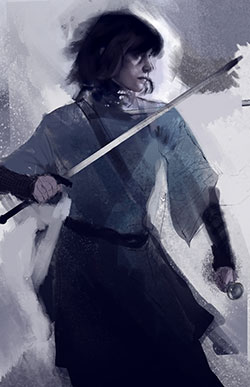
In the final rough Sabriel's inner strength shines through, yet her warrior stance and sword make it clear this is a story of action and adventure. There was some discussion about whether to include Mogget on the front cover or not; in the end we decided to focus on only the main characters on the front covers, and include the companions elsewhere.


